Target Decorated Apparel
Category: Branding, Identity, Logo, Signage, Website
WHERE DO YOU GO WHEN EVERYTHING NEEDS TO CHANGE?
Target Graphics is known in the contract screen printing industry for it’s consistently award winning four color process work and the only screen printer able to handle the exacting demands of companies like Threadless. The company had recently expanded their services to embroidery, mixed media and developed some innovative programs that further made them stand out from their competitors. Target Graphics had become one of the best in the country, but unfortunately, their name and dated logo just couldn’t keep up with the sophisticated work or expanded offerings. It was time for a makeover.
WHERE DO YOU GO WHEN EVERYTHING NEEDS TO CHANGE?
Target Graphics is known in the contract screen printing industry for it’s consistently award winning four color process work and the only screen printer able to handle the exacting demands of companies like Threadless.. The company had recently expanded their services to embroidery, mixed media and developed some innovative programs that further made them stand out from their competitors. Target Graphics had become one of the best in the country, but unfortunately, their name and dated logo just couldn’t keep up with the sophisticated work or expanded offerings. It was time for a makeover.
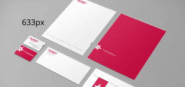
Along with the name change to Target Decorated Apparel came a great simplification of the logo. The new look is clean, modern and in line with their place in the industry. The new name and logo also works to future-proof the company so that continued expansion does not create a staleness in the brand. The star “A” mark was created per the client’s request for a mark that could be used separately from the logo.
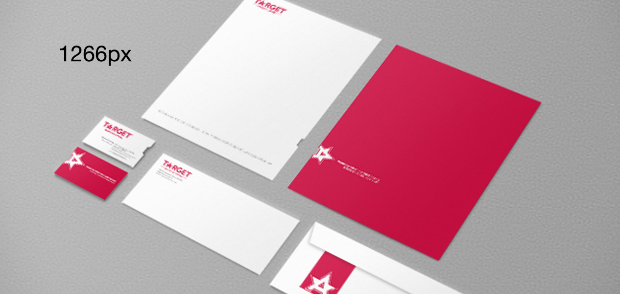
Next we developed a paper system including business cards, letterhead, envelopes etc. A series of master templates for their collateral pieces their internal graphics teams could build off of including brochures, catalogs and trade show signage rounded up their paper needs.
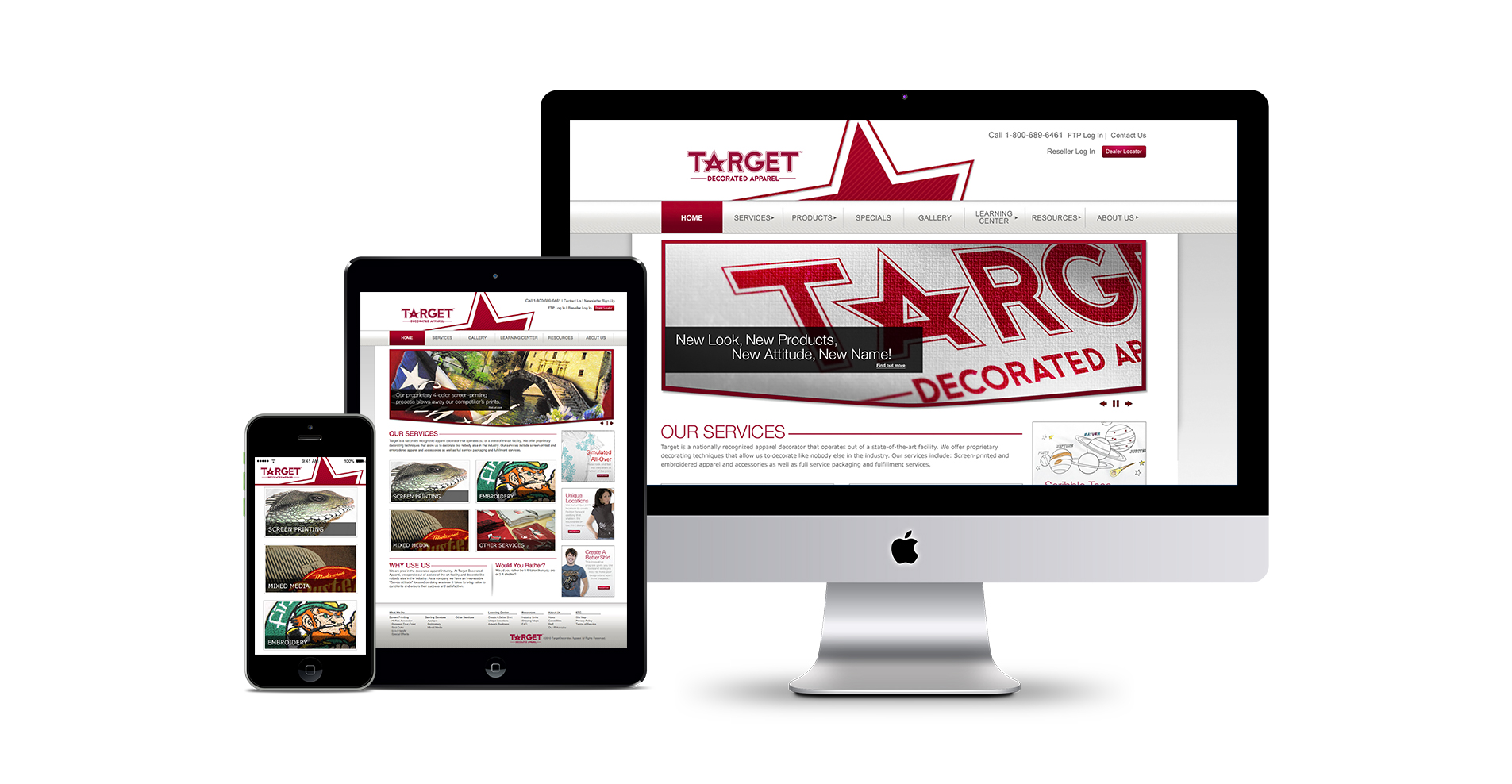
Once the new name, logo, paper system and master collateral templates had been developed, a new website was next on the to-do list. The old site was small, difficult to navigate, non responsive and low on the usability scale for both the company and their customers. We gave them a bright, clean, modern look with a WordPress site that was easy to use, responsive and had a huge number of custom programming features. Copy for the site was completely overhauled and we also provided them with new functionality such as a dealer locator as well as a back end customer login among other things. Now their site is in line with their claims to superior customer service.
Snackbox
Award-winning creative public relations firm
Austin • Chicago • Santa Fe
bonjour @snackbox.us

